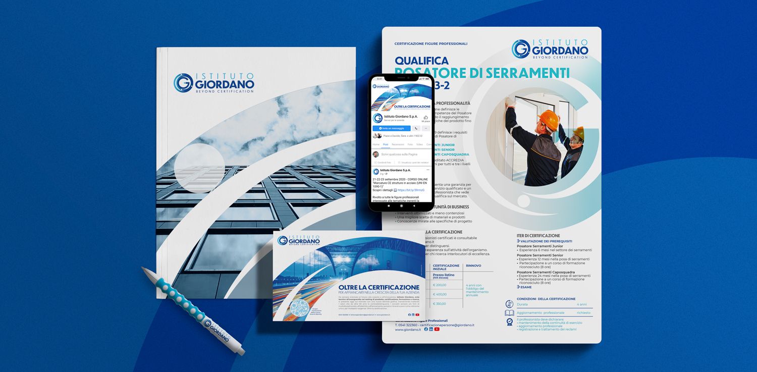
Our new brand identity. Backed by experience and eyeing the future!
Progress is the world's driving force and for more than 60 years has encouraged our quest for innovation and development.
We therefore invest constantly in research and new forms of certification, in order to assist in your professional future with the right tools.
Embracing this desire for growth and with our values as a cornerstone, we have decided to give our brand identity a facelift.

The underlying concept of this development is to increase the feeling of brand reliability that has always looked beyond certification, because there is much more:
Backed by these values and with an eye to the future, the new image is inspired by modern artwork of the atom and emphasises the energy and speed produced by the movement of the electrons that by orbiting around the nucleus, form the “G” of Giordano that can be seen as a centre and important focal point.
This gives added value to our underlying principles based on ongoing research, multidisciplinary nature of the laboratories and the central position of the single body.
The colours, that bring to mind a sense of professionalism, safety and technology, encompass all shades of blue from light to dark, maintaining continuity with the previous logo.
And because progress never stops, in order to ready ourselves for tomorrow's challenges, we always look beyond!

We therefore invest constantly in research and new forms of certification, in order to assist in your professional future with the right tools.
Embracing this desire for growth and with our values as a cornerstone, we have decided to give our brand identity a facelift.

The underlying concept of this development is to increase the feeling of brand reliability that has always looked beyond certification, because there is much more:
- There is our willingness to solve your problems
- There are experience and specialists skills in various fields of operation
- There is our commitment to helping people with their professional growth
- There is the strength of a large group whose outstanding certification services help to achieve important targets
Backed by these values and with an eye to the future, the new image is inspired by modern artwork of the atom and emphasises the energy and speed produced by the movement of the electrons that by orbiting around the nucleus, form the “G” of Giordano that can be seen as a centre and important focal point.
This gives added value to our underlying principles based on ongoing research, multidisciplinary nature of the laboratories and the central position of the single body.
The colours, that bring to mind a sense of professionalism, safety and technology, encompass all shades of blue from light to dark, maintaining continuity with the previous logo.
And because progress never stops, in order to ready ourselves for tomorrow's challenges, we always look beyond!


 Do you need more information about our services?